This is a piece of work that I did many years ago but given my recent post on Lifecycle (nee evolution). I thought I'd revisit it. I will assume the reader is entirely familiar with the concepts of commoditisation.
In figure 1, I've taken part of the evolution curve and modeled onto it a differential benefit curve (differential value - cost of implementation). This latter curve shows how the benefit of an activity changes as it evolves from its early innovation (where it is a strain on company resources) to a late product stage where the activity is ubiquitous and of insignificant differential value between competitors.
Figure 1 - Lifecycle & Differential Benefit (click on image for higher resolution)


When a new activity appears, you often get whitepapers written about it. These are generally done at a time when the activity is showing a highly positive differential benefit. Obviously there is a delay between the collection of data, the publication of the whitepaper, a user reading the whitepaper, the decision to do something and then implementation of the activity.
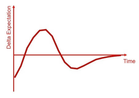
By the time an activity is implemented, the actual differential benefit may be vastly different. This creates a delta for expectation i.e. a difference from what we thought we would get and what we got. Figure 2 provides a graphical notation of this.
Figure 2 - Delta in Expectation (click on image for higher resolution)


Modelling this delta, with an awful lot of assumptions, provides the expectation curve shown in figure 3. There are a complex set of assumptions and conditions around this, however for the purpose of this post then I'm happy to say this curve is somewhat valid ... caveat, caveat ... except where it's not :-)
For the sake of this post, let's just pretend it is. What the curve shows is the early stages start with low expectations (but possibly high hopes), expectations are then quickly exceeded and continuously rise to reach a plateau after which expectations rapidly become unfulfilled leading to a trough of disillusionment before eventually levelling.
Figure 3 - Expectation Curve (click on image for higher resolution)

This all sounds strangely familiar and so it should. The expectation curve quite neatly maps to Gartner's hype cycle - see figure 4. So, we have a potential basis for explaining the underlying forces behind the hype cycle except of course, we have all the assumptions and I'm talking about expectation and not visibility. I'm not even sure what visibility actually means but given it's a hype cycle, I'll assume high hopes (expectations) means high visibility. Clocking up another assumption here.
Figure 4 - Hype Cycle & Expectation Curve (click on image for higher resolution)


Does our new underlying "basis" of the hype cycle shed any new light on the subject? Well, yes. However before I show this, I'd like to examine the final stages of lifecycle.
The evolution of an activity from products to utility services invokes its own expectation curve not through differential value (the creation of a new activity) but operational efficiency (a more efficient means of providing an existing activity).
In figure 5, I've provided the later stages of lifecycle including the transition from products to utility services and modeled an operational benefit curve (operational efficiencies over competitors - cost) of a transition to utility services. Again, lots of assumptions.
Figure 5 - Lifecycle and Operational Benefit (click on image for higher resolution)


NB. this benefit curve is the same shape as the earlier differential curve being derived from the benefit created over competitors, number of competitors exploiting the change and a changing cost of implementation due to maturity. Hence the transition to utility services starts with a period of investment, a rapid benefit over competitors gained by those creating or exploiting such services and then a decline in benefit over competitors as more companies switch to a utility model.
The reason why I mention this, is that whilst Cloud Computing is all about volume operations for ubiquitous and well defined activities (i.e. use of computer resources in business) and is hence all about commodities, this transition will create a similar expectation curve around operational efficiency in much the same way that a genuine innovation creates an expectation curve around differential value. This is shown in figure 6, and the result is the same delta in expectation curve shown beforehand.
Figure 6 - Delta in Expectation (click on image for higher resolution)


Our first "insight" is Gartner's hype cycle tends to show both innovative activities and transitional effects on the same graph. We should be careful to distinguish between operational efficiency (doing the same thing better) and differential value (doing a new thing) lest we start to confuse Cloud Computing with Innovation.
Hence, in the following hype cycle I've highlighted several activities, including :-
- cloud computing: more efficient provision of the existing activity of "using computer resources in business"
- social network analysis: a relatively new activity and a potential differential
Figure 7 - Expectation and Hype Cycle (click on image for higher resolution)


Figure 8 - Hype Cycle & Value Zones (click on image for higher resolution)


What this suggests is the early stages of the hype cycle has an increasing benefit. In the trough of disillusionment, there is still benefit to be gained but it's diminishing. However, in the slope of enlightenment and the plateau of productivity there is little or no differential or operational benefit over competitors since everyone else is doing it. That's our second "insight".
The lesson of this story has been known in military circles for a long time. An imperfect plan executed today is better than a perfect plan executed tomorrow i.e. if you wait until the activity can be easily and effectively implemented (the plateau of productivity), it'll provide little competitive benefit to you.
Fortune favours the brave.
[A final few comments]
To generate the expectation curve I had to create a model over time. This required lots of assumptions because the evolution (lifecycle) curve does not have a time axis (i.e. you can't predict when something will evolve). There are hence a couple of points I'd like to make clear.
- You can't simply overlay the expectation curves of different activities on top of each other - i.e. the axis of time is different (some are stretched, some are shortened). Gartner's curve doesn't define its time axis and we can therefore assume they're referring to a general shape which appears over an undetermined length of time.
- The Gartner curve specifically refers to the technology trigger. We can assume this is when the technology starts to spread and ignores any early stage effects (invention etc).
- If the Gartner curve was based upon the measurement of some physical property, it would be possible to reverse the process i.e. from Gartner curve to expectation curve to evolution lifecyle and accurately state where an activity was along the uncertainty axis. By very definition this is impossible. I can currently only state where something was in the past once it has become a commodity. Hence I have to conclude that Gartner's curve is not based upon some external measurement of physical property but instead it is more likely by a process of expert review (i.e. averaging where forecasters think something is on the curve) or even more simply, analysts placing dots on the curve.
- The Hype Cycle in its current form can have both novel activities and the evolution of the same activity to more commodity forms represented on the same position of the curve at different times i.e. a single activity may well go through the the peak of inflated expectations multiple times. In the first case, this will refer to the differential value of the novel activity but later on, the same activity will appear in the same position due to operational efficiency of a more commodity form. This occurs because the same activity can be given multiple different memes i.e. x86 architecture, client/server, hosting or cloud and whilst those memes are different, the underlying activity (i.e. provision of computing infrastructure) is the same. You cannot therefore use the Hype Cycle to determine evolution, notwithstanding the issue that it is time based and evolution cannot be measured over time (we have no crystal ball).
- The expectation curve matches the Gartner curve in certain circumstances. I cannot conclude much about the Gartner curve other than to say that its shape appears to have some validity in specific circumstance and I can approximate the value zones where the curve does match. This doesn't say anything about where the dots are placed on the curve just that the rise of increasing then diminishing then plateau of negligible benefits seems broadly right. That up, down, almost flat shape seems to have merit.
-- Update 10th Feb 2015
This uses an old form of the evolution graph. I've subsequently refined the terms innovation, custom built, product and commodity to genesis, custom built, product (+rental), commodity (+utility). The problem was that whilst I used "innovation" to mean the first ever attempt to put an activity in practice, the common use of the word "innovation" (used liberally to mean genesis of something, feature differentiation of a product, introducing a utility model for an existing activity) made that meaningless. Hence, I changed to use "Genesis" to re-assert the point.
Gartner Hype cycles no longer use Visibility vs Time but instead Expectations vs Time. The "time" axis seems to be only a generic sense of travel as the items on the hype cycle are given times to reach the plateau e.g.

I have no idea why they've made this change. Obviously, I was using an expectation curve and so again I broadly agree with the shape. I'm somewhat concerned that the axis changed but the curve didn't but given that the dots are just aggregated opinion, I suspect the curve is just an opinion as well. This doesn't mean it's not useful, as long you keep in mind it's just opinion all the way down.